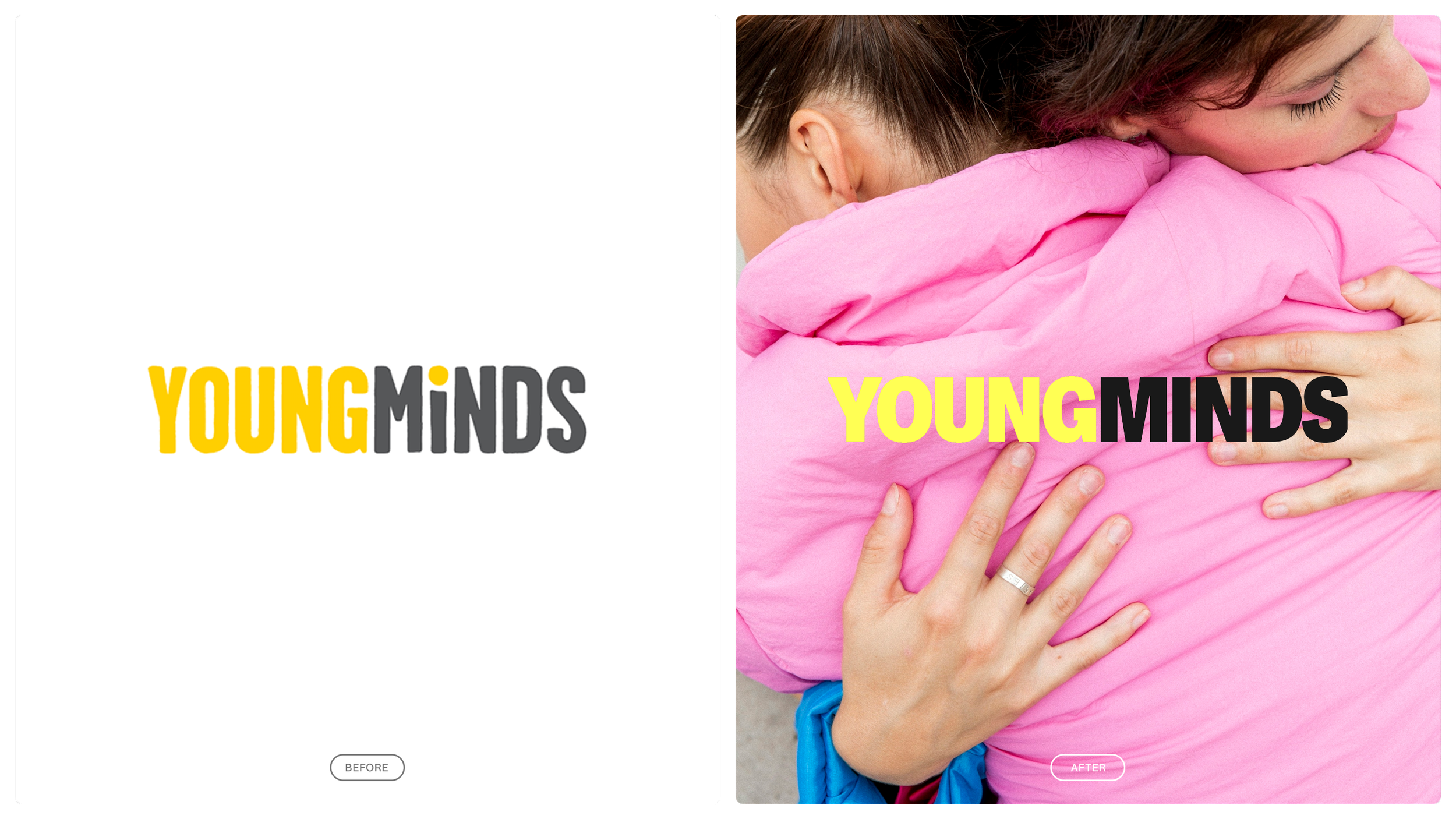
YoungMinds is the UK’s leading charity for young people’s mental health. They needed a brand refresh — one that would honour their legacy while building trust with broader, more diverse audiences.
Grounded in 20+ hours of research with young people, the rebrand was led by true youth insight. Clarity emerged as the top priority: if the message isn’t simple and direct, young people switch off. So we created a visual and verbal identity that’s clear, trustworthy and empowering — reducing overwhelm and making space for a full range of emotions.
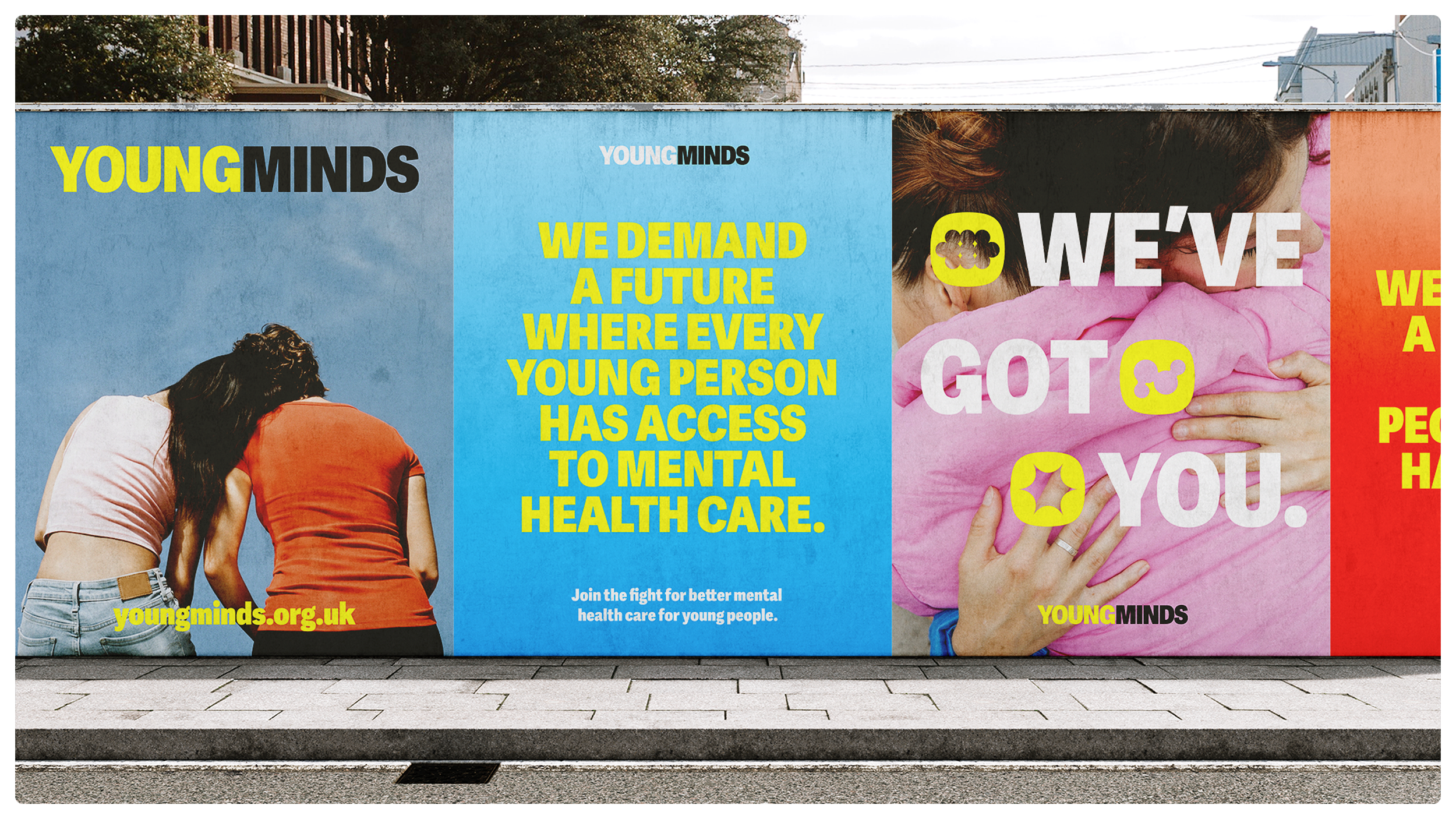
The creative concept, Brighter Futures, reoriented the brand around hope and strength. Trust was also key: the new identity signals authenticity and credibility through bold design, real voices and emotionally intelligent storytelling.
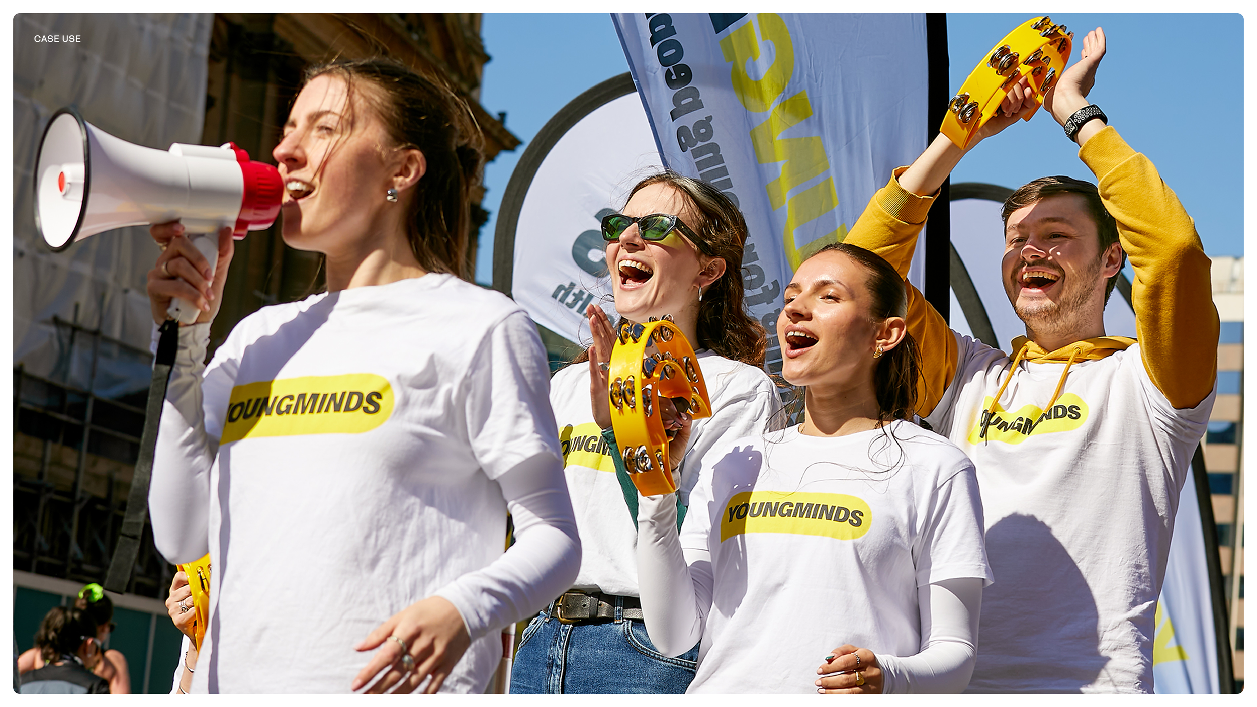
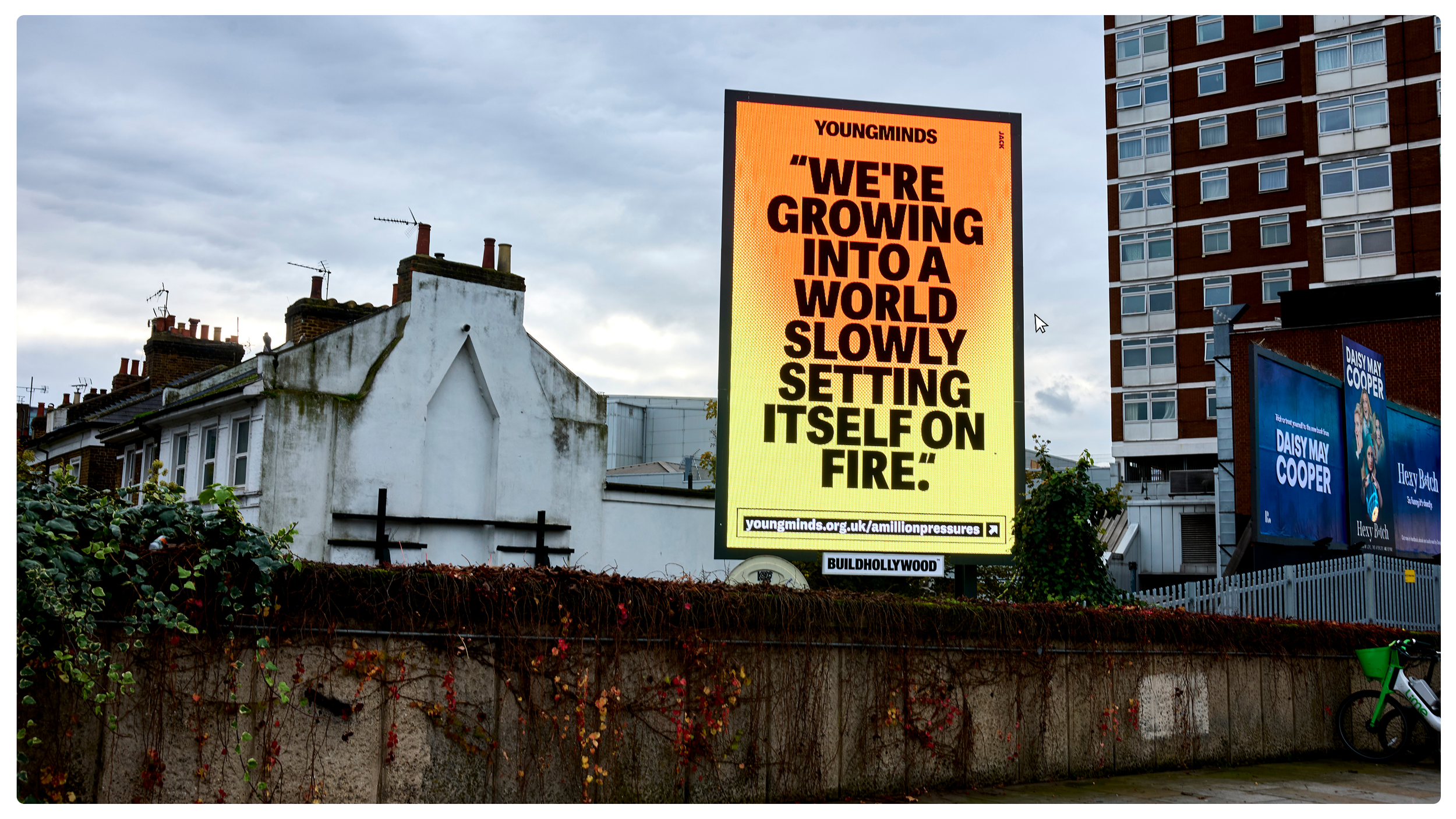
Inspired by protest aesthetics, the system uses bold type, vivid colour and striking layouts to reflect urgency and action. As lead designer, I helped shape this into a flexible identity embedded across brand, campaigns and organisational strategy — repositioning YoungMinds as a trusted, representative force for all young people.
YOUNGMINDS REBRAND
BRAND IDENTITY • COLOUR-WAYS • PRINT CARD DESIGN