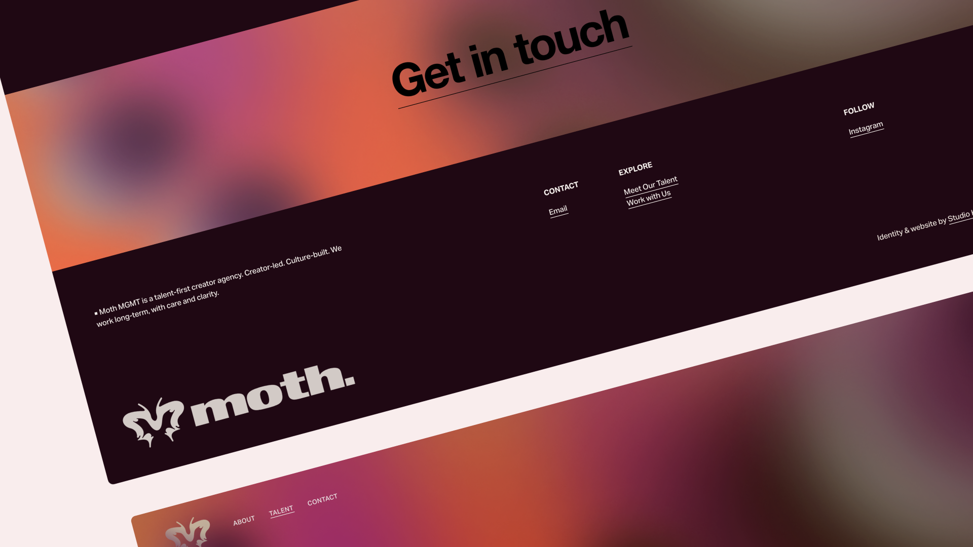
Moth MGMT is a talent management agency and production agency representing some of the most influential voices in digital culture. They needed a brand identity and logo that felt slick, contemporary and enabled them to represent their talent in a distinct way for market cut through.
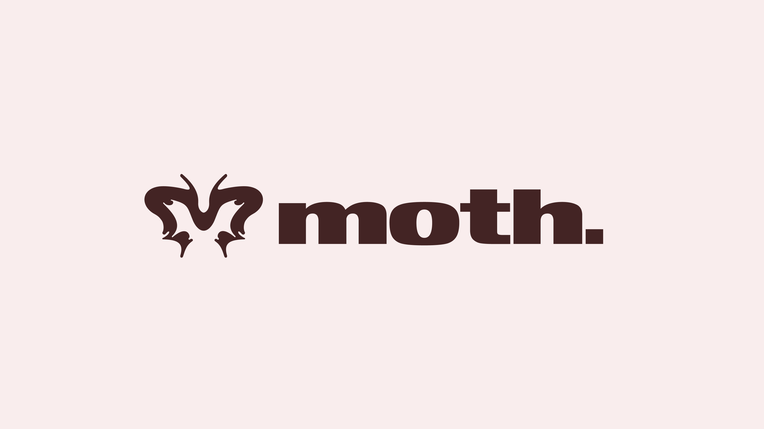
The identity centres on the idea of ‘moth to the light’ —
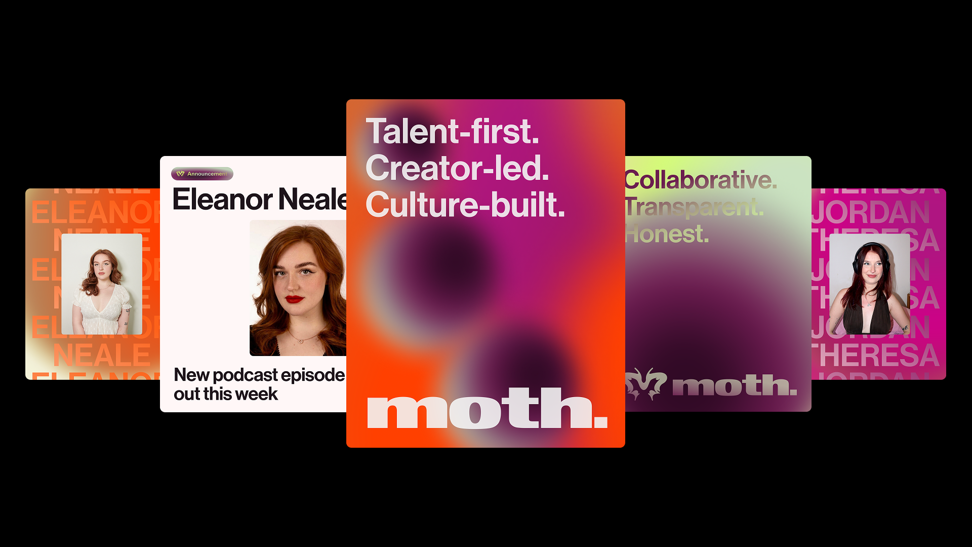
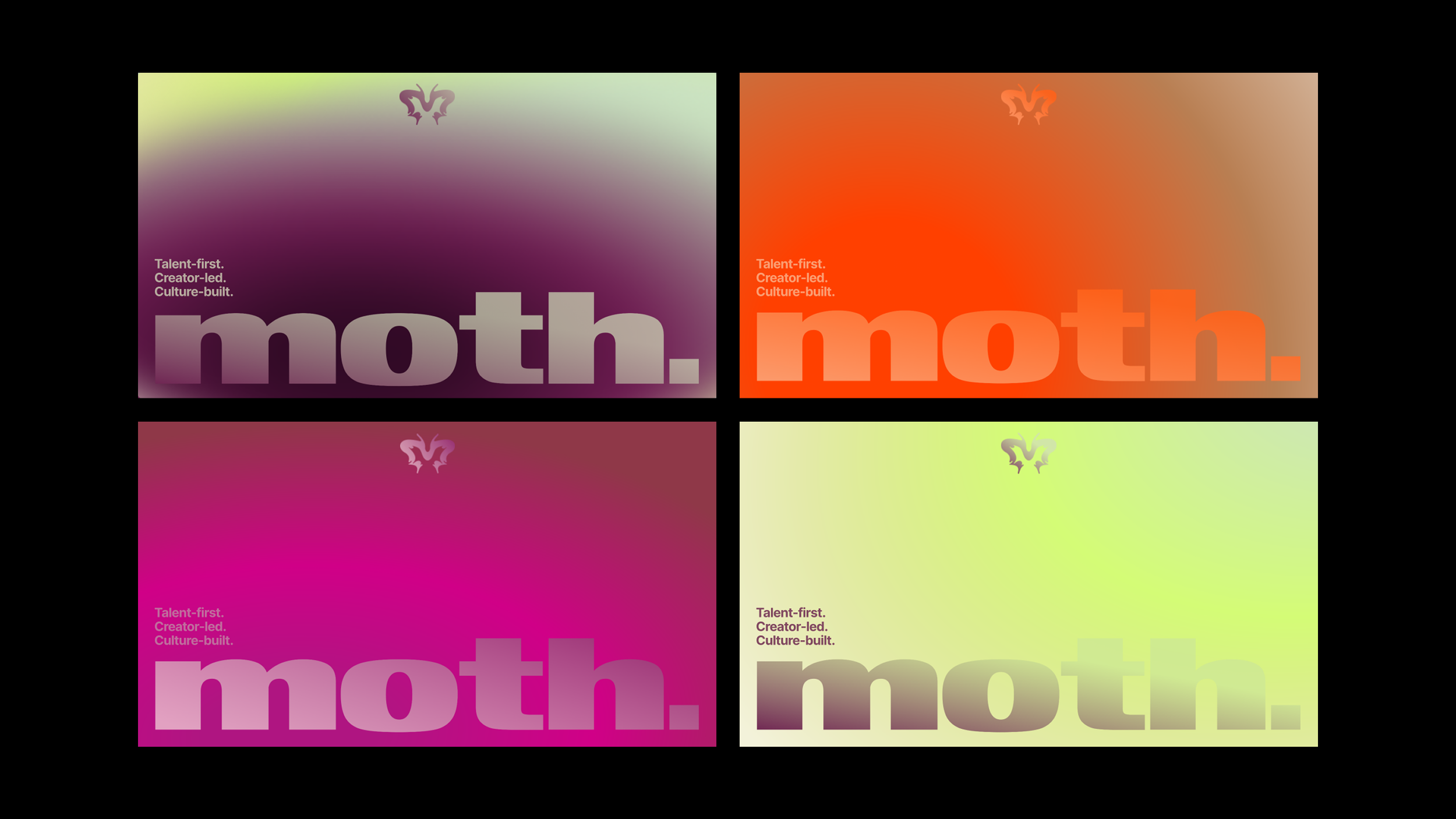
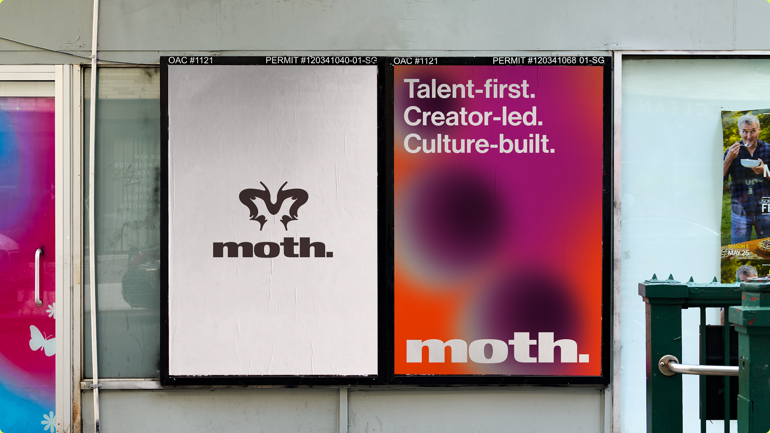
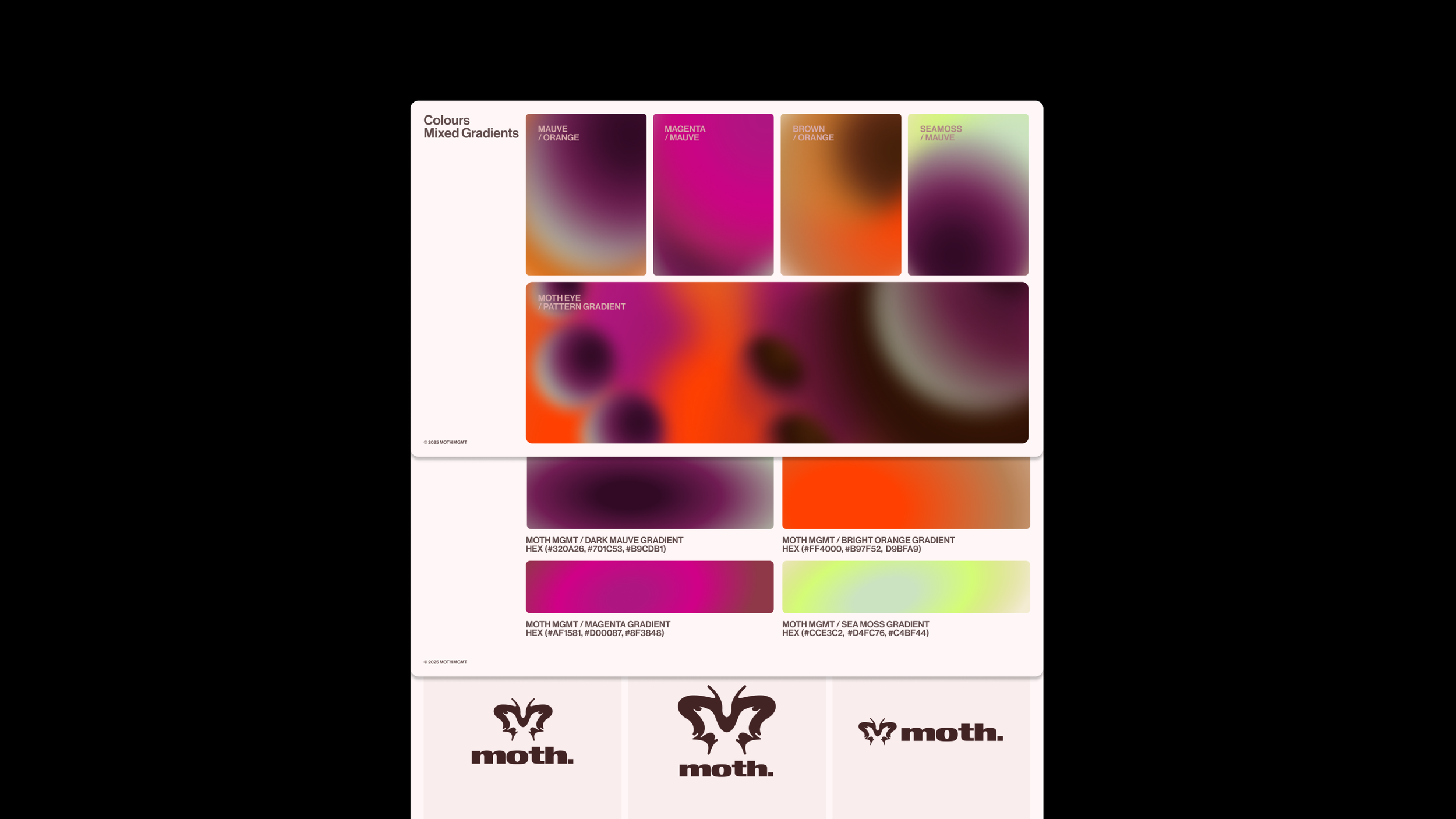
a symbol of trust and guidance for creators. At its core is an ‘M’ mark combined with the form of a moth, paired with a confident logotype. The colour palette draws from the rich, iridescent tones of moth wings, creating a distinctive and ownable visual language.
The identity helped position the brand as a trusted strategic partner in the creator economy — opening up new conversations with both talent and brands. The distinctive visual system gave the team a strong foundation to build from across pitch decks, socials, and digital touchpoints, and will play a key role in attaining partnerships and talent signings.
MOTH TALENT MANAGEMENT BRAND DESIGN
LOGO • BRAND IDENTITY • TYPE & COLOUR SYSTEM • SOCIAL • WEBSITE DESIGN