
CoppaFeel! is the UK’s leading breast cancer awareness charity for young people. As the brand aged up with its audience, we were tasked with helping it reconnect with Gen Z through a bold new identity.
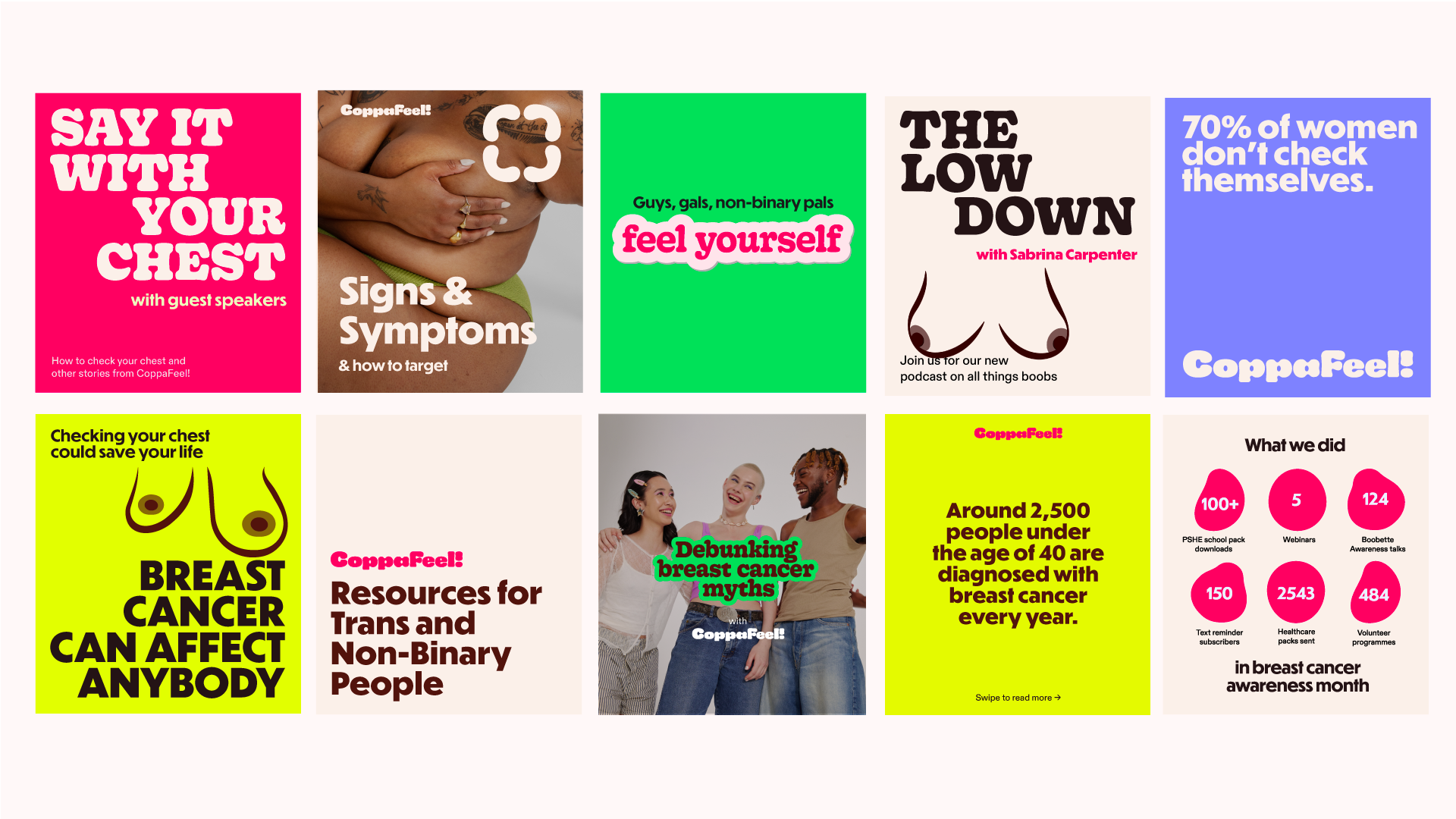
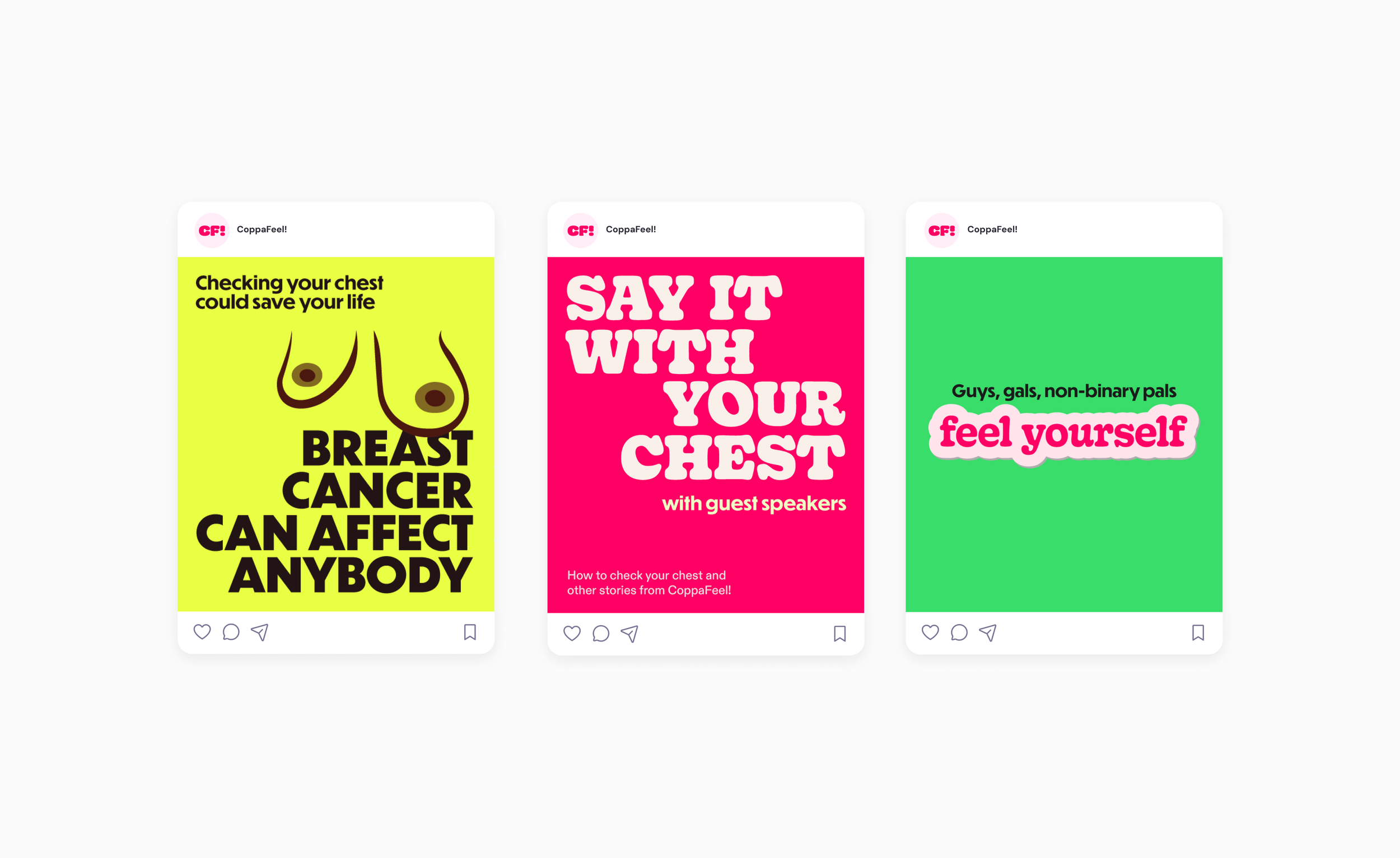
Grounded in research which guided the rebrand with three core principles — keep it cheeky and iconic, make it inclusive of all bodies and identities, and ensure it works across both medical and editorial spaces — we created the concept of Urgent/Squish. This balances the life-saving urgency of CoppaFeel!’s mission with a playful, tactile feel that resonates with younger audiences.
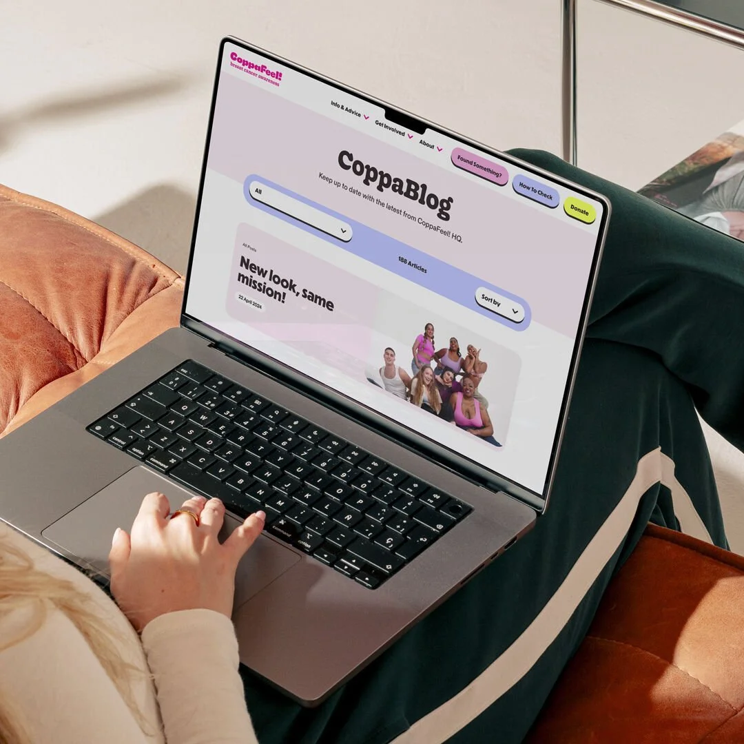
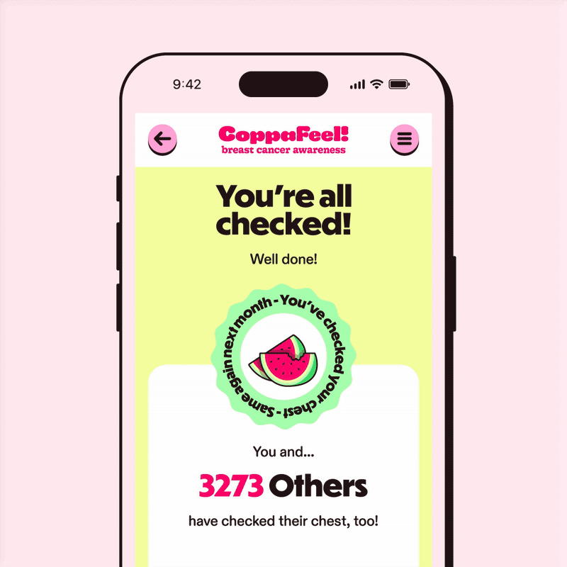
At the heart of the refresh is a squishy, typographic logomark — an immediate visual reminder to check yourself. The wider system uses expressive type, visual metaphor, and a colour palette inspired by emergency services to convey the importance of breast cancer awareness in a way that’s unmistakably CoppaFeel!.
The result? A joyful yet urgent brand identity that re-energised fundraising, amplified the charity’s message, and reconnected CoppaFeel! with the next generation.
COPPAFEEL! REBRAND


CREDITS
Livity Brand & Research Team
Lucy Harmony Grimes
Fiona Ghobrial
Rachael Kendrick
Emily Hang
Gorgia Brewer
Sheyi Ogunshakin
Type Designer Tina Smith
Icons by Jordan @ Studio Anti-Gravity
Photography
Naomi Wong
CD: Jane McFarlane
Website & web assets
Milk & Tweed